
airtime media selection bar project
This project redesigns the core navigation “media” bar, which gives users the ability to find and post Youtube, Soundcloud music, photos, and GIFs while they chat or are in live video mode. The ability to experience media together is Airtime’s main differentiator, so this project is key to app success.
Contributions:
• Self-initiated research around media selection/sharing and users’ mental models.
• Simplified number of choices using analytics as a guide.
• Conducted card sorts to determine which icons required the least cognitive load to understand.
• Introduced familiar UI patterns such as trays/drawers for fast, searchable media selection.
• Designed consistent UI across all types of media selection.
Original Selection Bar and Brief
Given the very simple project brief outlining business requirements and hypotheses, I examined the current media bar, shown on the right, to discover how users were currently interacting with the controls (analytics).

Sketching


Began to look at app analytics for most used media streams, thus illuminating low used choices. It became clear that most posts were from YouTube and SoundCloud channels. I sketched the idea of a paired down bar with other choices under a more icon.
While focusing on the media bar itself, I also began sketching ideas for posting other types of media such as GIFs, photos and how that would work going back into chat mode. I considered the pros and cons to UI and how it was arranged, number of taps and needed transition animations.

While sketching, I also reviewed similar competitive apps like Cabana and HouseParty. I also looked at popular chat apps like Snapchat and WhatsApp for inspiration.
Mockups
In these wireframe explorations, began exploring what representation was most recognizable by users (Words, logos, icons, etc.) I considered how long it would take users to process the available choices. Brand recognition was also a very strong factor (using logos). Also mocked up team suggestions around using words and generic icons as well.

High Fidelity Prototype
In these higher fidelity mockups, began laying out key screens for export to an Invision prototype to test with internal team and our user testers. Key screens include home and YouTube tray, photo tray, and GIF tray. My goal was to use consistent UI regardless of the media type, while also containing familiar, media specific controls (Like basic photo selection in IOS).


Sketch File
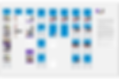
This is the Sketch file for each feature of the new selection bar. The vertical columns inform the engineers to each state of the individual UI element as it is interacted with. I also maintained style and iconographic use with a Sketch Symbol Library.

Visual Design
New media bar was then visually designed, with careful placement and sizing of brand logos. Due to a technical constraint, camera and album needed to be individual icons, so chat field was adapted to fit. In addition, more visual refinement was done to all the media trays, search fields and other controls.
Success Metrics
Here are some highlights around the successful new design. In the near future we plan to iterate on the camera and album icon, uniting them under one icon.
